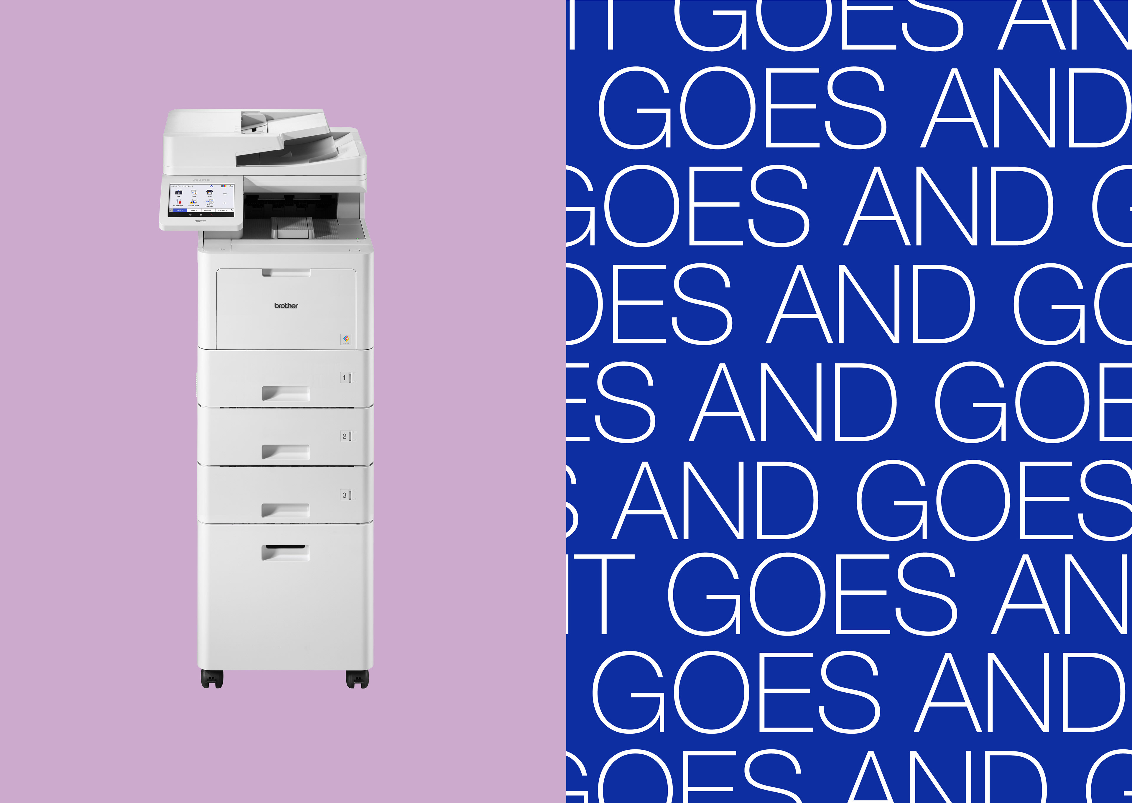
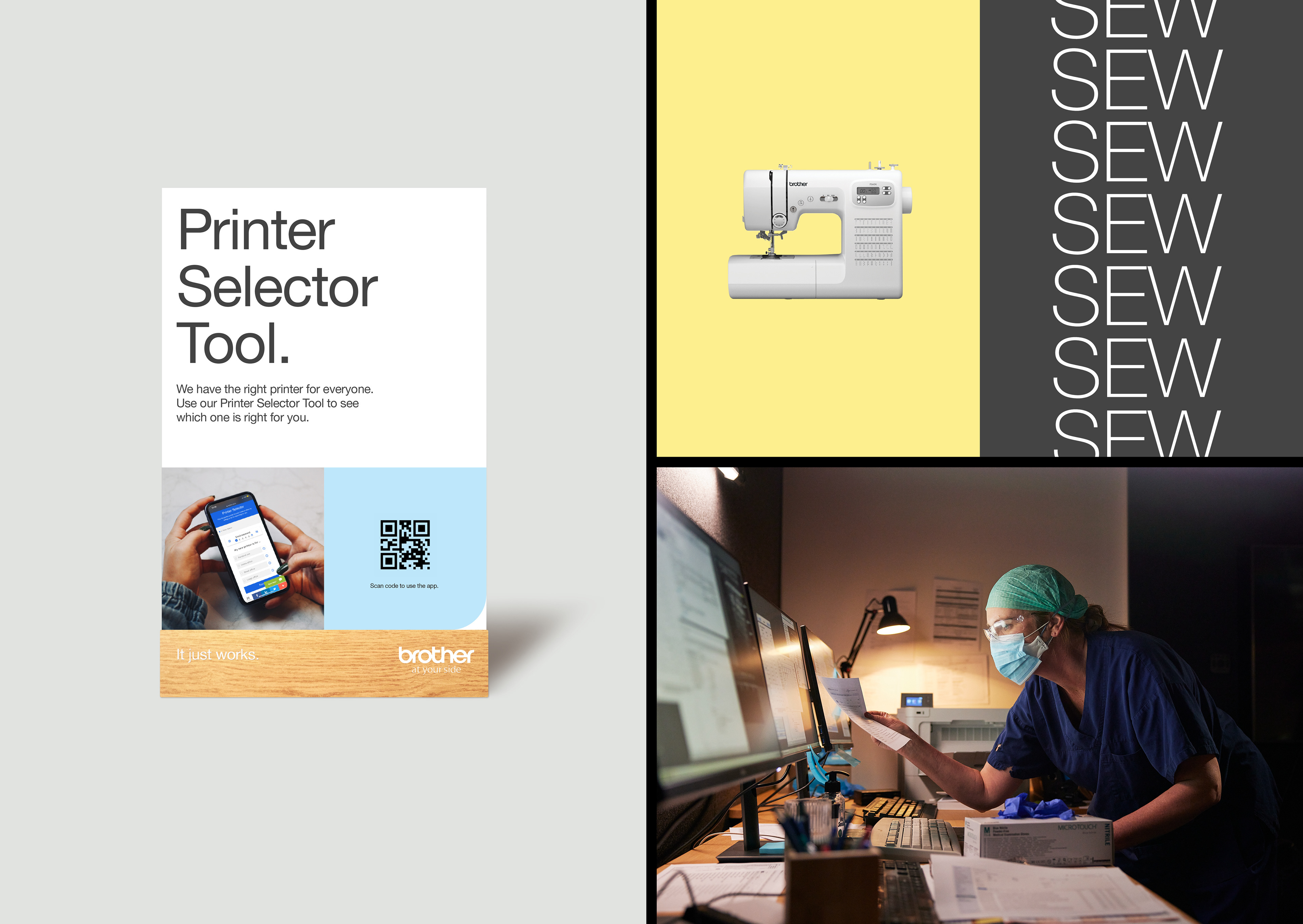
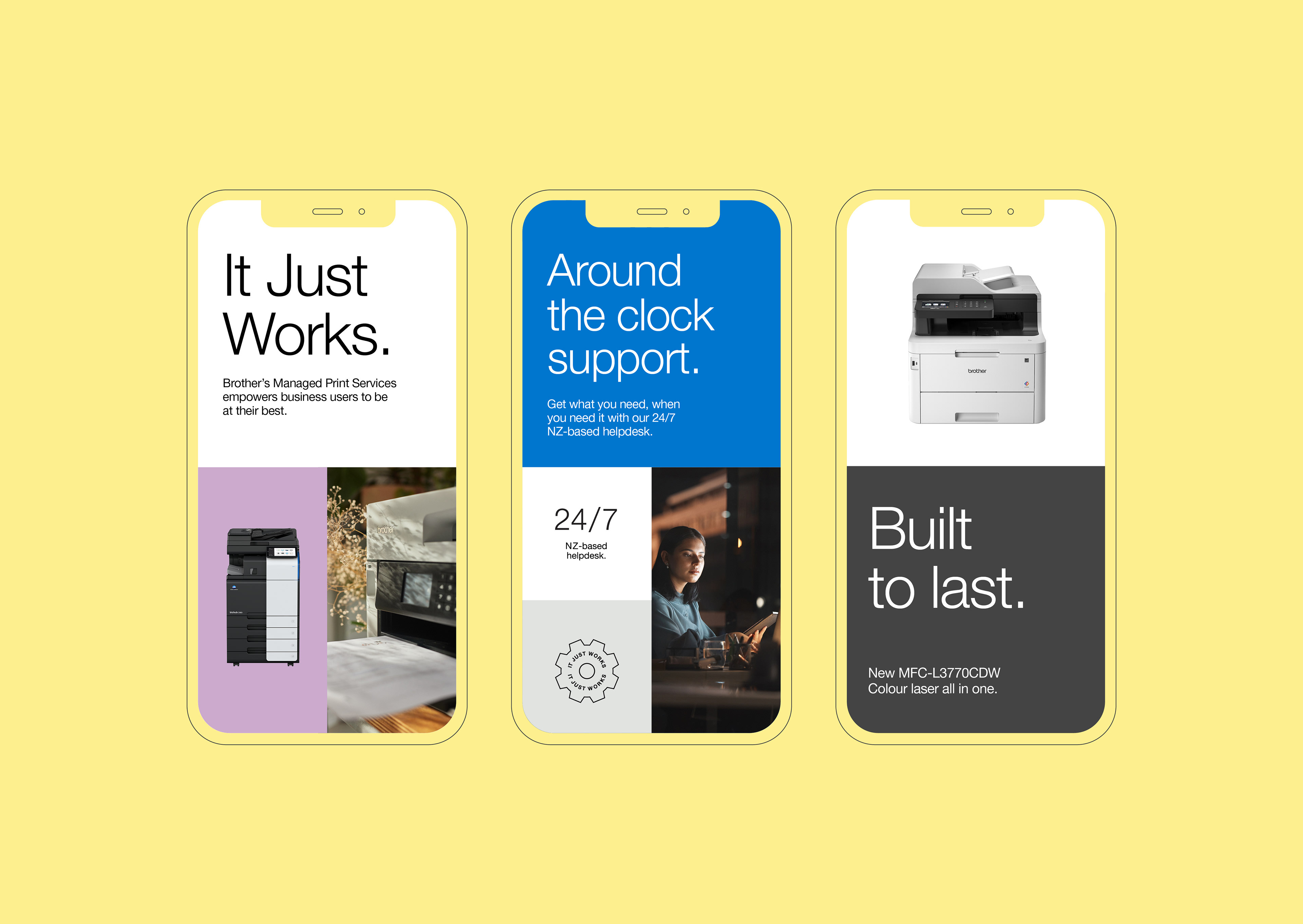
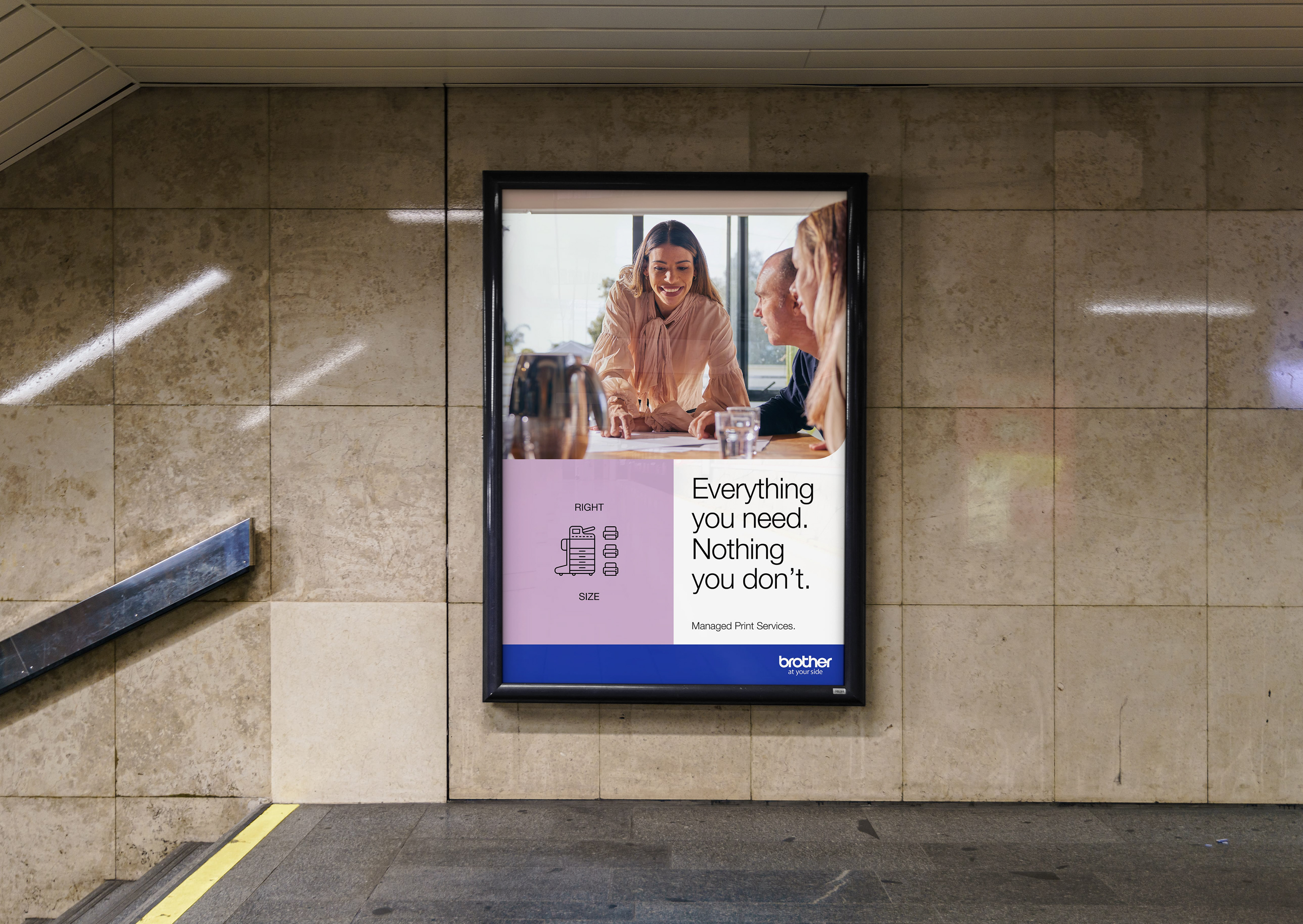
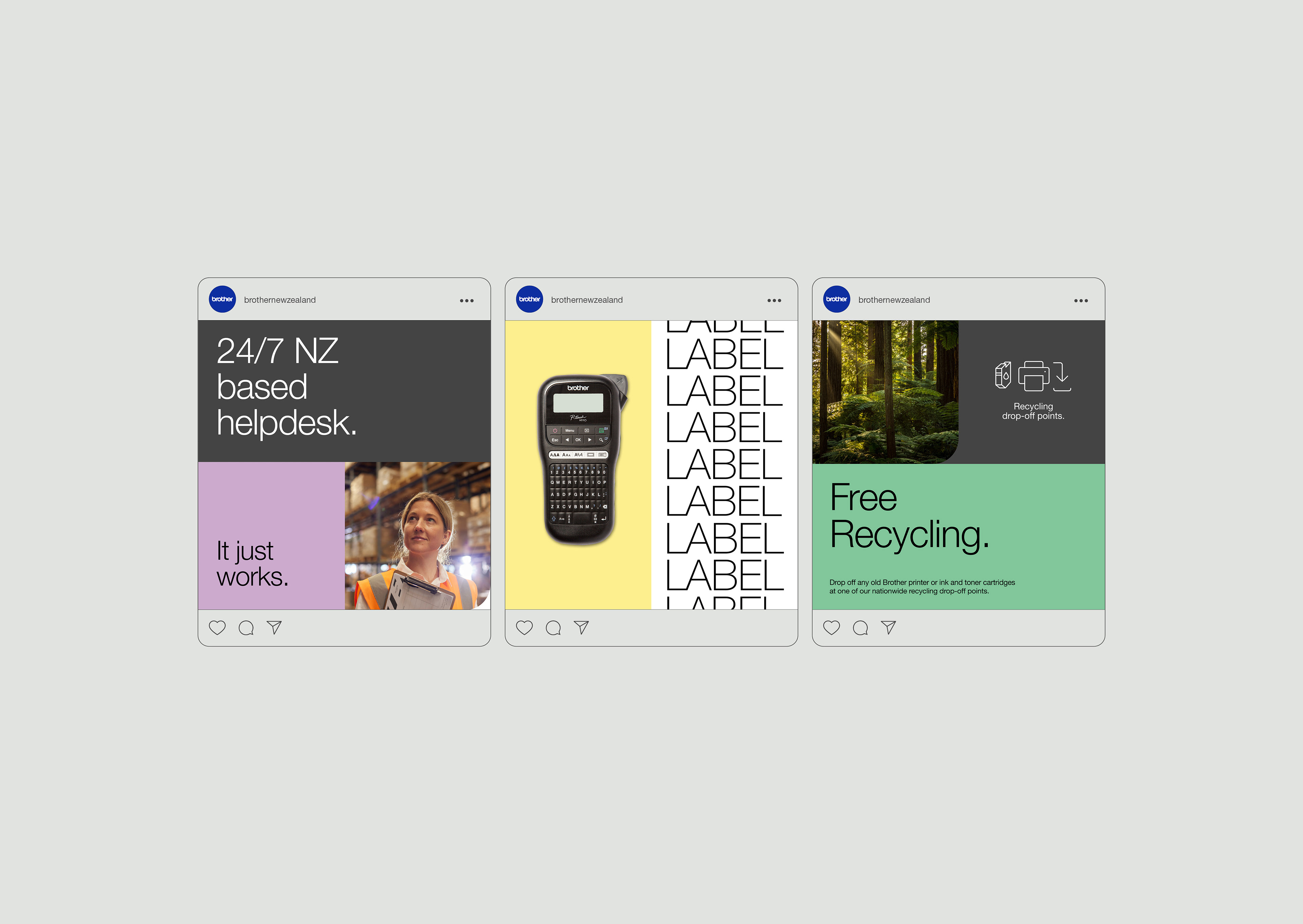
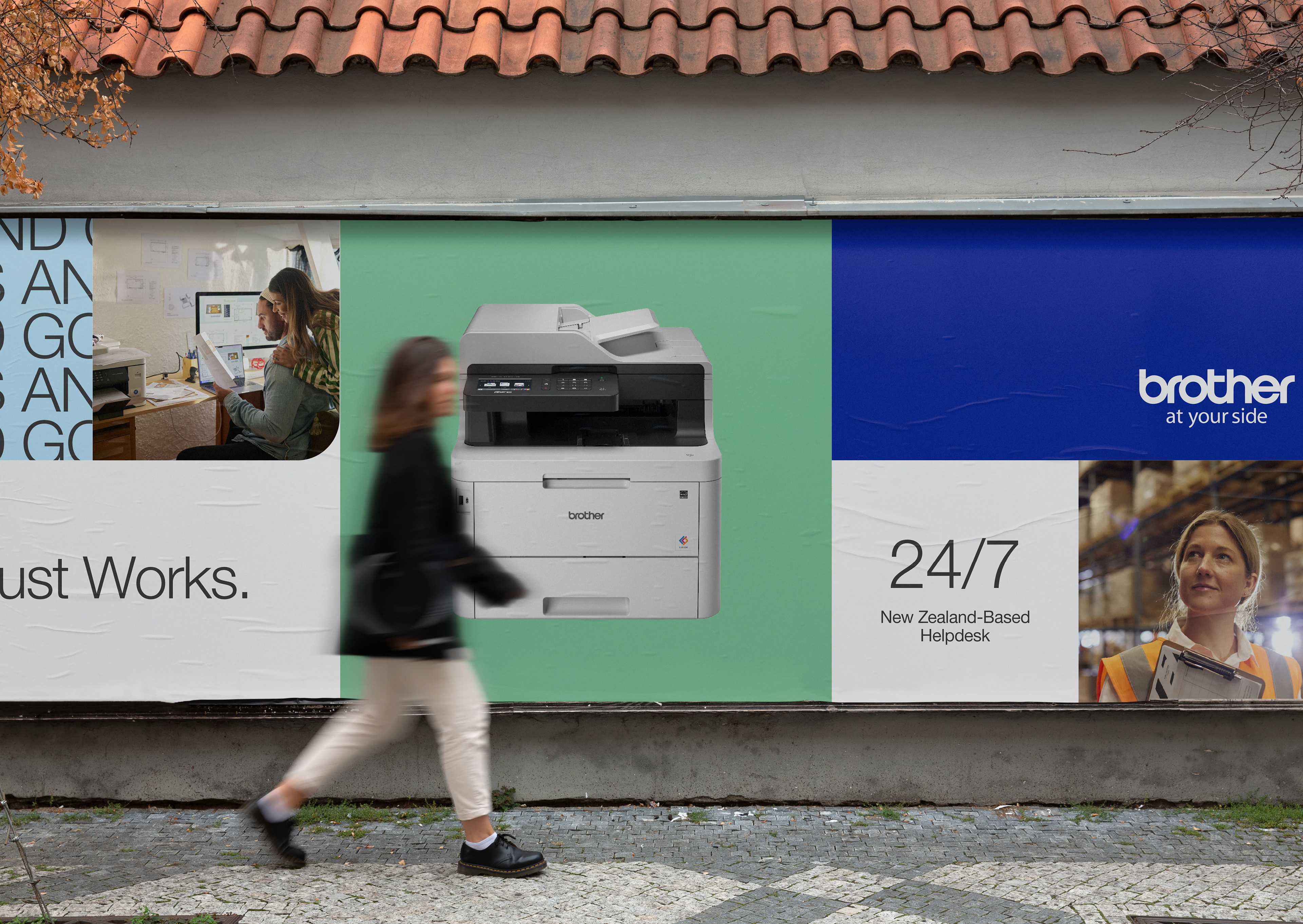
Rejecting typical technology advertising with exaggerated promises, and focusing on what customers truly need: a reliable printer that works seamlessly.
This idea, rooted in Brother’s history sets them apart by emphasising reliability and simplicity, aligning with the practical needs and values of New Zealand customers.
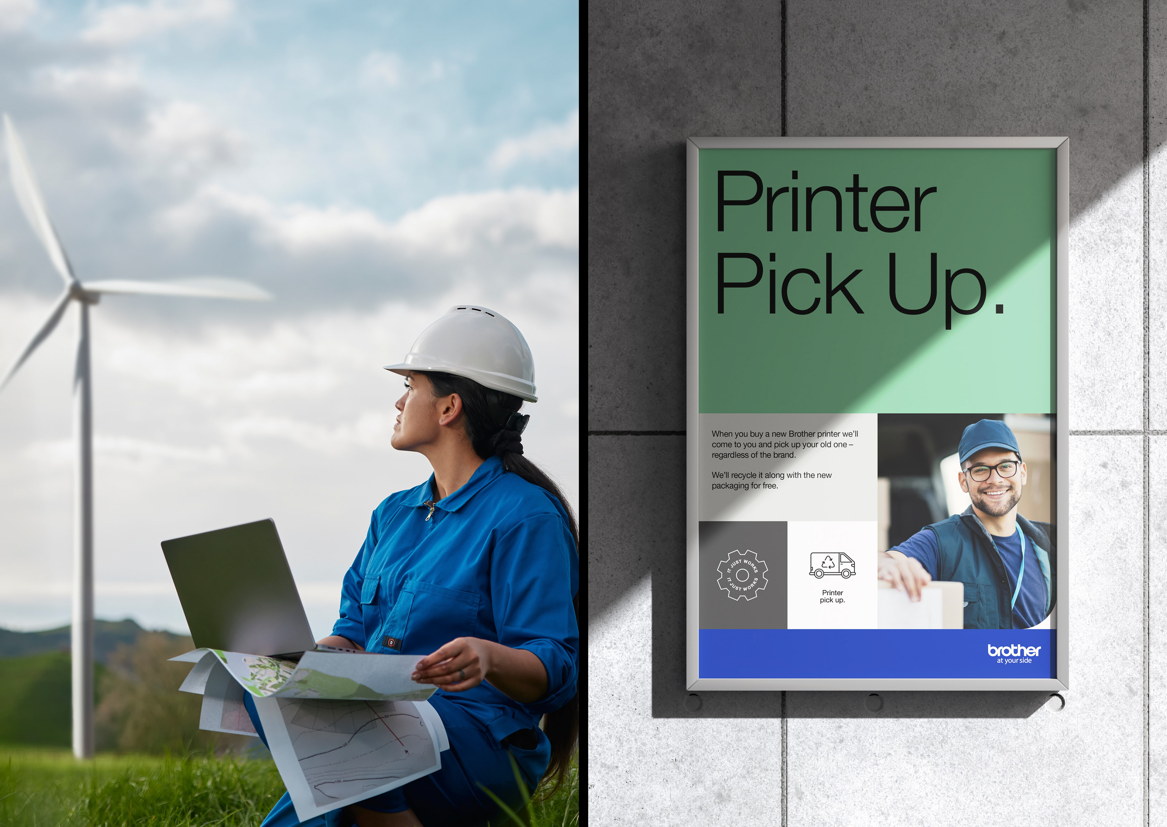
The design elevates the message by highlighting the true innovator in the user-printer relationship: the person using it. This fosters a positive connection, allowing users to see themselves in the brand’s narrative.
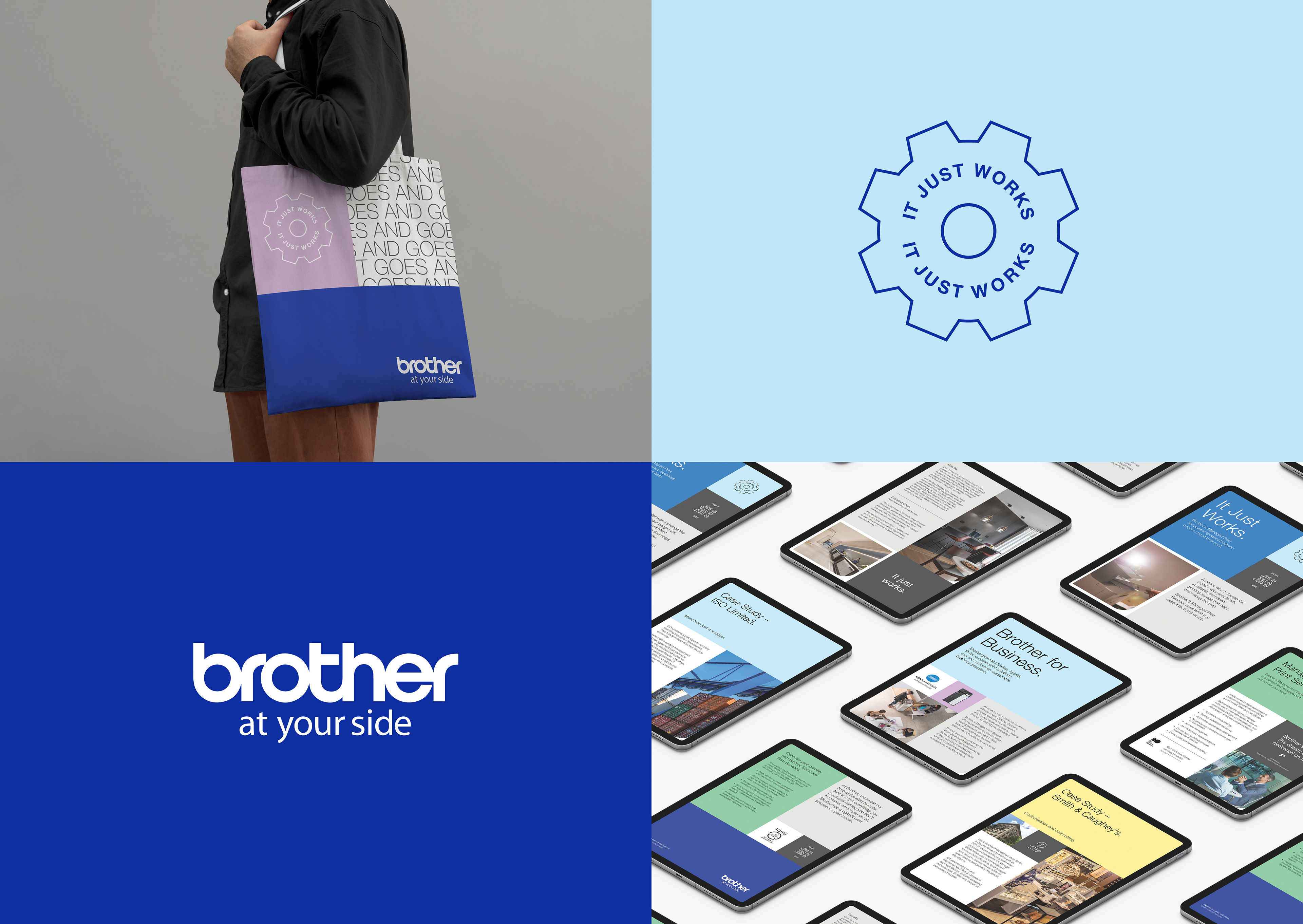
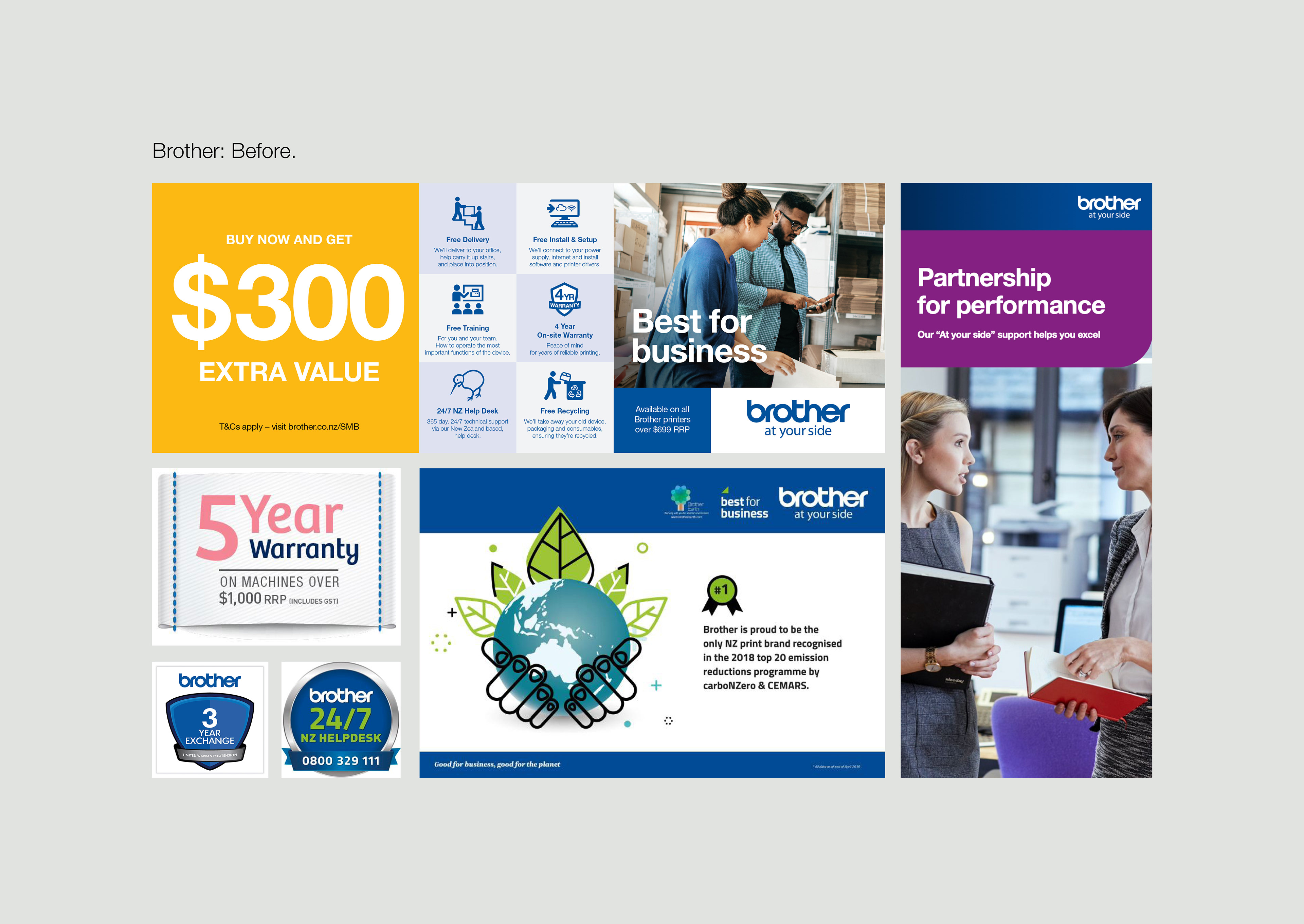
Brother New Zealand’s revitalised brand identity captures the essence of the company’s mission and values. It presents a refreshingly honest, unified and flexible visual system that resonates with customers, supports brand growth, and elevates its market presence.
